

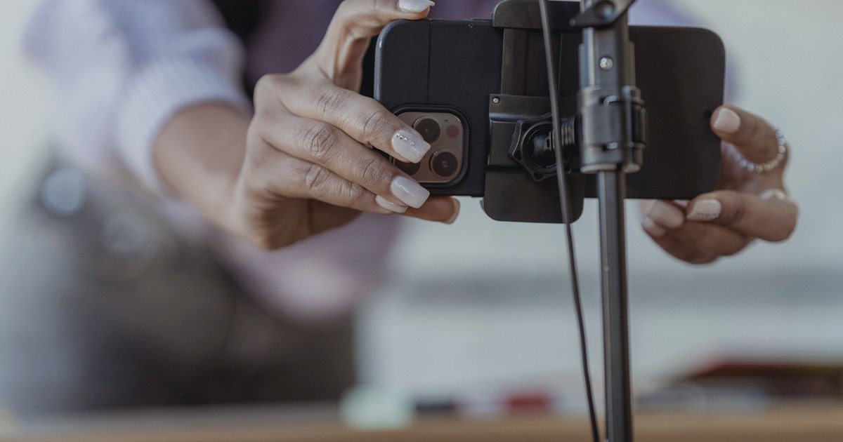
A trust badge is the smallest graphic on your store doing one of the biggest jobs: answering, in the half-second before someone types a card number, the question "is it safe to buy here?" Done well, a little cluster of security and payment icons near the checkout button quietly removes a reason to leave. Done the way most PrestaShop stores do it — a row of payment logos dumped in the footer — it does nothing at all, because nobody anxious about paying ever scrolls to the footer to feel reassured.
This guide is specifically about trust badges: the payment, security and guarantee graphics that signal "this is a real, safe shop." It is not about the colored NEW / SALE / HOT flags you put on product thumbnails — those are merchandising labels, a different tool with a different job, covered in product badges and labels and custom product badges. And it is not about review widgets or live-sale popups, which earn trust a different way (links at the end). Here we cover why trust badges work, which types genuinely matter, exactly where on a PrestaShop store to put them — by hook name — and how to measure whether they moved anything.
Why a small icon changes buying behavior
Trust badges work on a borrowed-credibility shortcut: a shopper who already trusts Visa, PayPal or a padlock transfers a little of that trust to your store when they see the logo next to your checkout. It is the same instinct that makes a branded delivery van feel safer than an unmarked one. The badge does not prove anything technical — it lowers perceived risk at the exact moment perceived risk is highest.
Every online purchase quietly triggers three separate worries, and different badges answer different ones:
- Payment safety — "will my card details get stolen?" Answered by security seals, the padlock, and visible payment-brand logos.
- Money risk — "what if it never arrives, or I want a refund?" Answered by a money-back / returns guarantee badge — but only if it links to a real policy.
- Will-it-be-right risk — "is this shop legitimate and the product as described?" Answered by independent review badges (Trustpilot, Google) rather than by anything you can draw yourself.
The Baymard Institute's checkout research consistently finds that a meaningful share of shoppers abandon specifically because they "didn't trust the site with their credit card information" — roughly one in six in their published reasons. That is the slice a security badge near the payment form is aimed at. Note the careful claim: a badge nudges the undecided, anxious buyer. It does not double your conversion rate — anyone promising that is selling you the icon, not the result. Published A/B tests of badges report lifts ranging from low single digits to the high teens depending on how untrustworthy the page looked to begin with; treat those as directional, and measure your own store rather than borrowing someone else's number.
The five badge types — ranked by how much they actually matter
Not all badges pull their weight. Roughly in order of impact for a typical PrestaShop B2C store:
| Badge type | Worry it answers | Where it earns its place | Watch out for |
|---|---|---|---|
| Payment-security seal (padlock, SSL, "secure checkout") | Card safety | Beside the payment form and the Place Order button | Must be real — a padlock on a non-HTTPS page is a lie shoppers can check |
| Payment-method logos (Visa, Mastercard, PayPal, Apple/Google Pay, BLIK) | "Can I pay my way?" + brand trust | Product page and checkout | Only show methods you actually accept |
| Money-back / returns guarantee | Post-purchase regret | Cart and checkout, near the button | Must link to a real returns page — a badge linking to a 404 is worse than none |
| Free shipping / free returns | Hidden-cost fear (the #1 abandonment cause) | Product page, near the price, above the fold | Only if genuinely free, or the threshold is stated |
| Independent review badge (Trustpilot, Google) | "Is this shop legit?" | Footer, product page, and your homepage | Show the live rating + count, not a bare logo |
Two honest boundaries. First, custom "100% Secure Shopping" graphics with a clip-art padlock carry near-zero weight, because borrowed credibility needs a brand the shopper already trusts — there is nothing to borrow from a logo you invented. Second, the independent-review badge is the one type you should not fake or hand-draw; it only works because a third party stands behind the number. Setting that up properly is its own topic — see Trustpilot for PrestaShop and Google Customer Reviews, which is literally a free trust badge from Google itself.
Placement: the part that decides whether badges do anything
Where a badge sits matters more than which badge it is. A perfect Norton seal in the footer is invisible; a plain padlock next to the Place Order button is working. Shopper attention on a product page funnels through a narrow path — image, then price, then the Add to Cart button — so badges belong in that path, not in a sidebar or below the description fold where almost no one looks.
Product page — first reassurance
Directly under the Add to Cart button: payment-method logos, a free-shipping line if it is true, and a returns guarantee. Keep it to three or four small icons. Crowding ten logos here reads as desperation, not safety.
Cart page — pre-checkout nerves
The cart is where the total lands for the first time. A compact strip near "Proceed to checkout" — a security seal plus the returns guarantee — steadies the moment before payment.
Checkout — peak anxiety, highest-impact slot
This is where a security badge earns the most. Shoppers are about to type a card number; a padlock and "Secure checkout" beside the payment form is the single most valuable badge placement in the whole store. Put payment-method logos near the card field and the guarantee near the Place Order button.
Header strip and footer — supporting, never the only placement
A thin top bar ("Free shipping over 199 zł · 30-day returns · Secure checkout") sets an ambient tone, and the footer is fine for SSL and processor logos as a completeness signal. Neither converts on its own. Footer-only badges are the most common mistake we see — they are essentially decoration. Badges have to sit at decision points or they do nothing.
One hard limit across every zone: three to five badges, no more. Past that, the row starts to look like a sponsorship wall and the effect inverts — the page reads as trying too hard rather than trustworthy.
Mobile is where badges matter most — and where stores get them wrong
More than half of most PrestaShop stores' traffic is mobile, and mobile abandonment runs higher than desktop. A smaller screen feels less "official" and typing a card on a phone feels riskier, so the reassurance is needed more — yet desktop badge rows routinely break on phones: wrapping awkwardly, shrinking below legibility, or sliding far under the button where they vanish.
- Use one horizontal, scrollable strip rather than letting badges wrap onto three ragged lines.
- Keep them within a thumb-scroll of the button. If a shopper has to scroll past Add to Cart to find the badges, they are functionally invisible.
- Don't let icons shrink below roughly 32–40px high or they stop being recognizable, which kills the whole borrowed-trust mechanism.
- Test on a real device. Chrome DevTools' responsive view is not the same as an actual iPhone — render and tap-target behavior differ.
Putting trust badges on a PrestaShop store
You have two routes, and the choice is the usual one: edit your theme for full control, or use a module so the placements are managed from the back office and survive your next theme update.
Route 1 — template / hook approach (full control)
PrestaShop exposes display hooks at roughly the decision points above. These are the common ones to check — but hook presence and where they actually render can vary by theme and checkout implementation, especially around the payment block, so confirm them in your active theme and register fallback hooks where one doesn't render. The ones to start with:
| Hook | Where it renders | Use for |
|---|---|---|
displayProductAdditionalInfo | Below Add to Cart on the product page | Payment logos, free-shipping, guarantee |
displayShoppingCartFooter | Cart page, under the summary | Security seal + returns badge |
displayPaymentTop / displayBeforePayment / displayPaymentReturn (or the theme's checkout templates) | Checkout, around the payment block | Highest-value security placement |
displayFooterBefore / displayFooter | Footer | SSL + processor logos (secondary only) |
A minimal module registers the hooks and returns a template:
public function install()
{
    return parent::install()
        && $this->registerHook('displayProductAdditionalInfo')
        && $this->registerHook('displayShoppingCartFooter')
        && $this->registerHook('displayPaymentTop');
}

public function hookDisplayPaymentTop($params)
{
    $this->context->smarty->assign([
        'trust_badges' => $this->getActiveBadges('checkout'),
        'module_dir'   => $this->_path,
    ]);

    return $this->display(__FILE__, 'views/templates/hook/checkout-badges.tpl');
}
Two practical notes. Use SVG, not PNG. A badge SVG is typically 1–3 KB and stays razor-sharp on retina phones; a 2x PNG can be 20–50 KB each, and that adds up once it is on every product page — exactly the kind of weight that drags your PageSpeed score down. And the CSS that keeps the row tidy on mobile is one media query — switch the flex row from wrapping to a horizontal scroll under 768px:
@media (max-width: 768px) {
  .trust-badges {
    flex-wrap: nowrap;
    overflow-x: auto;
    -webkit-overflow-scrolling: touch;
    justify-content: flex-start;
  }
  .trust-badge img { height: 32px; width: auto; }
}
Route 2 — a module (managed from the back office)
If you would rather not touch theme files — and not have your badge placements wiped by the next theme update — a configurable badge module lets you pick which badges show in which zone from the back office, swap them seasonally, and keep everything upgrade-safe because nothing forks your theme. So what does that buy you? You change "free shipping over 199 zł" to "over 149 zł" for a campaign in two clicks instead of editing a .tpl, and the row stays correct after you change theme. If you want this handled cleanly, browse the conversion-focused modules in our module catalog — choose a route, but choose one that does not leave badge markup baked into a theme you will later replace.
Across PrestaShop versions
PrestaShop 9 ships a Symfony-based back office and refreshed theme architecture, but the front-office display hooks above are unchanged. Target those stable hooks and your badges keep rendering across 1.7, 8.x and 9.x without a rewrite at every upgrade.
Common mistakes that quietly waste the effort
- Footer-only placement. The badges exist but nobody anxious ever sees them. Move at least the security seal to checkout.
- Too many badges. A wall of ten logos reads as desperate and can drag conversion below the no-badge baseline. Three to five per zone.
- Invented seals. A hand-drawn "Secure" badge transfers no trust because there is no trusted brand behind it.
- Dead links. A guarantee badge that 404s, or a "verified" seal pointing nowhere, actively damages trust — every badge that implies a claim must link to the proof.
- Stale review counts. "127 reviews" baked into a static image while your Trustpilot shows 2,400 makes the whole store look neglected. Pull the live number via the provider's widget instead.
- Desktop-only testing. The placement that looks perfect in a resized browser is the one that breaks on a real phone, where most of your traffic and most of your abandonment live.
How to tell whether it actually worked
Don't judge badges by gut feel, and don't judge them on three days of data. Before you change anything, record four numbers from your analytics, each split by device: add-to-cart rate, cart-to-checkout progression, checkout completion rate, and overall conversion. Then add the badges and compare the same four numbers over at least 2–4 weeks and enough sessions to be a real trend — push to six weeks if your traffic is modest. Segment the result: the lift is usually larger on mobile, larger for first-time visitors than for returning customers who already trust you, and larger on higher-priced items where the financial worry is greater. If you only look at the blended number, you will miss the pattern that tells you where to double down.
Where trust badges fit in the bigger trust picture
Badges are one signal among several, and they are most effective when the rest of the store backs them up — a clean, professional layout, clear policies, and visible proof that other people have bought safely. Two threads worth pulling next:
- Does the store look trustworthy at all? Badges can't rescue a page that already looks improvised. The wider design signals are in design signals that build or break confidence.
- Proof that real people are buying. Reviews and live-purchase cues answer the "is it legit?" worry that badges only gesture at — see customer reviews on your store, the sales popup that shows recent purchases, live sales notifications, and a total-products-sold counter for stores with the volume to make it impressive.
The honest version of the headline is this: a trust badge will not double your sales by itself. What it does is remove a specific, well-documented reason a hesitant shopper bails at the payment step — for near-zero cost and an hour of work. Put the security seal where the card number gets typed, the payment logos where the buying decision happens, the guarantee where the regret-fear peaks, keep it to a handful of recognizable icons, make sure they render on a phone, and measure for a month before you decide it worked. The badges are not decoration; treated as part of your checkout's trust architecture, they pull their small but real weight every hour the store is open.


Comments
No comments yet. Be the first!
Be the first to ask a question or share useful feedback.
Leave a comment
Share a question, an installation detail, or feedback that could help another reader.