



Here is the distinction worth getting straight before you build anything: a PrestaShop category page is a tool, a grid the customer uses to filter, sort and compare their way to a decision. A gallery page is a stage. It hands the screen to the photography, drops the filters and the facet sidebar, and lets a curated set of products carry the mood. Same products, sometimes the same URL structure, completely different job. The mistake we see most often is merchants turning a working category page into a gallery and quietly killing the layered navigation, sorting and SEO signals that were doing the actual selling. This guide is about building a genuine gallery page on PrestaShop without that trade-off. Which template to override, what the category controller will and won't hand you, and when a CMS page is the right call instead.
When a gallery page is the right tool, and when it sabotages you
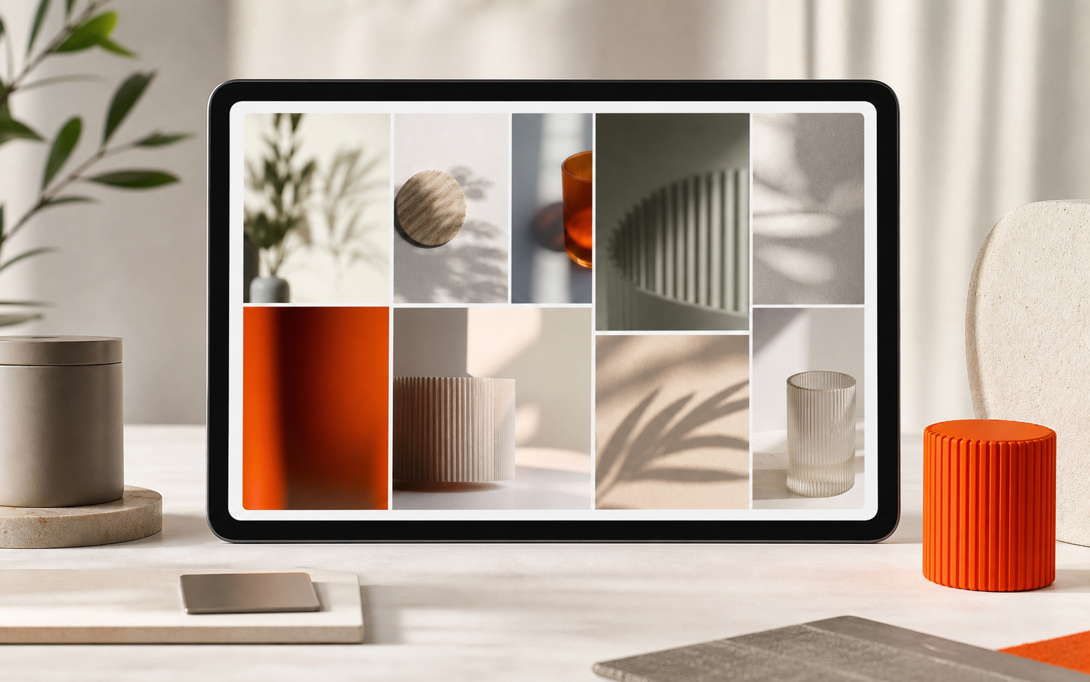
A gallery layout earns its place when the image is the argument. Fashion, jewellery, home decor, furniture in room settings, handmade goods, styled food, products where a customer decides with their eyes before they read a single spec. For those, a clean masonry wall of lifestyle shots converts because it removes the cognitive overhead of a spec-heavy grid.
It actively works against you for technical or comparison-driven products. Electronics, parts, anything where the buyer is matching a model number, a wattage or a compatibility table. Strip the facets off a category of CPU coolers and you haven't made it beautiful, you've made it unusable. The honest test: if your customers reach for the filter sidebar before they reach for the photos, a gallery page will lose you orders, not win them. Keep those on a standard category page and put your effort into the product page anatomy that gets the click instead.
One more honest boundary: a gallery is a top-of-funnel device. It makes people want something. It does not close, the moment a customer commits, they still want the full product page with its price, combinations, stock and add-to-cart. Treat the gallery as the hook, not the whole journey.
The three ways to build one in PrestaShop, and what each really costs
PrestaShop has no "gallery page" button. There are three real routes to one, and they differ less in the visual result than in who maintains them and what you lose along the way.
| Route | Effort | Keeps product data live? | Survives upgrades? | Best when… |
|---|---|---|---|---|
| CMS page, hand-built HTML | Medium, front-end work | No, manual links | Yes (it's just content) | A fixed showcase: "Our Collection", a lookbook, a portfolio that rarely changes. |
| Custom category template override | Medium-high, needs a dev | Yes, live PrestaShop catalogue | Fragile across major versions | A real product category you want to present as a gallery while keeping stock, price and filters. |
| Gallery / lookbook module | Low, install & configure | Depends on the module | Yes, if vendor-maintained | You want the layout from the back office without forking your theme or hiring a developer. |
Route 1. A CMS page when the content is fixed
For a one-off showcase that doesn't change weekly, the simplest route is a CMS page. In the back office go to Design → Pages (it lives under Preferences → CMS on 1.6), add a page, and switch the editor to source view to paste your own gallery markup. The page renders through the CmsController and the cms.tpl template in your theme, so you get a clean, indexable URL with none of the category machinery.
So what does that mean for you? Total control over the layout and zero risk of a core update breaking it, but every product tile is a link you typed by hand. Add a product to the collection and you edit the page. That's fine for "Spring 2026 Lookbook"; it's a maintenance trap for a category that turns over constantly. If you go this route, give it a human-readable URL, /spring-collection, not /content/12-untitled, using PrestaShop's friendly-URL field on the page (and a URL manager if you need to clean up the legacy pattern across the store).
Route 2. Overriding the category template for live products
This is the route most merchants actually want and most underestimate. PrestaShop renders a category through the CategoryController, which assigns the product list to the category.tpl template, and the individual tiles come from product-list.tpl / the miniatures/product.tpl partial in the classic theme. You can copy those templates into a child theme and rewrite the markup into a masonry or full-bleed gallery while the controller keeps feeding you the live catalogue, real stock, real prices, real combinations, and the faceted-search filters from ps_facetedsearch still wired up underneath.
The advantage over a CMS page is exactly that: the gallery stays in sync with your catalogue automatically. The cost is two-fold. First, it's developer work, you're editing Smarty templates, not clicking toggles. Second, template overrides are the part of a theme most likely to break on a major PrestaShop upgrade (1.7 → 8 → 9 all moved theme internals), so budget for a re-test at every jump. If you want only some categories to look like galleries, branch on the category id or a category feature in the template rather than overriding every list in the store.
Route 3, A module when you'd rather not touch the theme
The third route exists because most store owners aren't going to maintain a Smarty override across upgrades, and a fixed CMS page can't keep pace with a live catalogue. A gallery or lookbook module gives you a drag-and-drop builder in the back office that outputs the layout into your theme through standard hooks, no forked templates, so nothing to re-patch when you upgrade. The trade-off, stated honestly: you get less pixel-level freedom than hand-built HTML, and you're trusting the vendor to keep the module current. Pick one that's actively maintained and that renders into your existing theme rather than fighting it. The win is that the gallery becomes something you arrange yourself, the way you'd expect to manage merchandising, not a developer ticket every time a collection changes.
The interactive layer that makes a gallery feel premium
A flat wall of images is a start; the interactions are what separate a gallery that feels designed from one that feels like a Pinterest screenshot. Each of these is a deliberate decision, not a default:
- Hover-swap to a second image. Showing a second shot on hover doubles the visual information per tile without adding a page. In a category override this means making sure each product has a strong second image in its image set, and that your tile template renders it, a native hover swap isn't a guaranteed classic-theme default, so plan on theme support or a small template/custom-CSS implementation, and test the listing-tile markup to confirm the second image is in the DOM to swap to.
- Quick view. Letting a customer open product details and add to cart from a modal, without leaving the gallery, keeps the browsing flow intact. PrestaShop's classic theme includes AJAX quick-view markup and behaviour rendered in a modal; the listing tiles already wire it up, so in a category override preserve the quick-view trigger and its modal integration when you carry the tiles over to your gallery markup.
- Lightbox zoom for detail-driven goods, jewellery, textiles, craftsmanship shots, where the customer wants to inspect the surface before they care about anything else.
- Load-more over pagination. A gallery reads better as a continuous wall than as numbered pages. Infinite scroll or a "load more" button keeps the mood unbroken. Just keep a crawlable paginated path underneath it so search engines can still reach every product.
Photography is the gallery's foundation. Get it right first
A gallery page is an amplifier: it makes good photography look better and bad photography look much worse. The layout demands sharp images that hold up displayed large, and, more than anything, consistency. Mismatched lighting, backgrounds and crops read as amateur the instant they sit side by side on a wall. If your catalogue shots aren't there yet, fix the photography before you build the page, because no layout rescues inconsistent images. We cover what actually sells in product photography for e-commerce, and how to get there without a studio budget in product photography on a budget.
Don't trade your SEO away for the look
This is where gallery pages quietly cost stores ranking. Two ways it happens. First, if you build the gallery as a hand-coded CMS page, you've replaced an indexable category, with its product links, structured data and breadcrumb, with a slab of HTML that search engines see as one flat document. Second, if you override the category template and strip the intro text and headings to keep it "clean", you delete the very content the page was ranking on.
Keep both. A gallery still wants a real H1, a paragraph or two of collection copy that gives Google something to read, and descriptive alt text on every image, "linen midi dress in oatmeal, side view", not "image1.jpg". On a category override, the products remain real links so the page keeps passing equity inward. And give it a clean, keyword-bearing URL rather than a query string. The goal is a page that's beautiful to a human and legible to a crawler at the same time, for the broader picture of presenting products to convert, see our product page design best practices.
Image weight: the one thing that can sink the whole page
A gallery is image-heavy by definition, twenty, fifty, a hundred large photos competing to load at once. Unoptimised, that's the slowest page on your store, and on mobile it's the page customers abandon before it finishes painting. The non-negotiables are WebP delivery, lazy-loading so off-screen images wait their turn, and responsive sizes so a phone isn't downloading a 2400px desktop image onto a 375px screen. This is involved enough to deserve its own treatment, we cover the full approach in PrestaShop image optimization. The short rule: test the finished gallery on a real phone over a throttled connection, and if it isn't usable inside about three seconds, it isn't done.
The decision, in one line
Build a gallery page when the photograph closes the sale and a spec sheet would only get in the way; keep a filtered category page when the customer is comparing rather than admiring. Then pick your route by who maintains it: a CMS page for a fixed showcase, a category-template override when you need live catalogue data and have a developer, or a module when you want to arrange merchandising from the back office without forking your theme or re-patching it every upgrade. Whichever you choose, don't let the look cost you the navigation, the product links or the readable content that were quietly earning the traffic in the first place. The best gallery pages are the ones a crawler and a customer both find beautiful.
FAQ
Should I turn my main category page into a gallery?
Only if your customers decide with their eyes rather than by comparing specs. For fashion, jewellery, decor or anything styled, a gallery layout helps. For technical or comparison-driven products, where the buyer reaches for the filter sidebar first, stripping the facets to make it pretty will cost you orders. If in doubt, keep the standard category page and build a separate gallery as a top-of-funnel hook rather than replacing the working page.
Will a category-template override break when I upgrade PrestaShop?
It can, and you should plan for it. Theme template overrides are among the most upgrade-fragile parts of a store, and the 1.7 → 8 → 9 jumps each moved theme internals. The override keeps your gallery in sync with live catalogue data, which is its big advantage, but budget a re-test of the gallery template at every major version bump. A vendor-maintained gallery module avoids this because it renders through hooks rather than forked templates.
Does a gallery page hurt my SEO?
It does if you build it as a flat hand-coded CMS page that replaces an indexable category, or if you strip the H1 and intro copy from a category override to keep it "clean." It doesn't have to. Keep a real H1, a paragraph or two of collection copy, descriptive alt text on every image, real product links, and a clean keyword-bearing URL. A gallery can be beautiful to a human and legible to a crawler at the same time.
How do I stop a gallery page from loading slowly?
A gallery is image-heavy by nature, so the load is the risk. Serve WebP, lazy-load off-screen images so they wait their turn, and use responsive sizes so a phone isn't downloading a 2400px desktop image. Then test the finished page on a real phone over a throttled connection, if it isn't usable within about three seconds, it isn't done yet.
Can I make only some categories look like galleries?
Yes. In a template override, branch on the category id or a category feature so the gallery markup only renders for the categories you choose, leaving every other category list on the standard grid. That keeps comparison-driven categories filterable while presenting your image-led collections as galleries, without overriding every product list in the store.


