


Let PrestaShop shoppers compare products side by side in a feature table


Product Compare is a module for PrestaShop stores that lets shoppers collect products while browsing and set them side by side in one clear table that ends with add to cart. Installation places the compare buttons across listings and product pages on its own, and the first comparison works the moment the module is enabled.
The problem it settles is the five-tab shopper. A visitor torn between similar products opens them all, loses track, and leaves to decide somewhere else, or never decides. The comparison keeps that decision inside the shop, on one page, with the facts lined up and the cart one click away.
The module starts simple and configures deeply. You set how many products a visitor compares at once, and the limit holds both in the browser and on the server, so it cannot be talked around. You choose where the compare buttons appear, switch the floating shortlist tray on or off, adjust the button, tray and table appearance to your theme, decide which facts and features the table shows and in what order, restrict comparison to chosen categories, and write your own message for an empty comparison. The table highlights differences and similarities, and one control shows only the rows where products differ.
Shoppers need no account: the shortlist lives in their own browser, survives navigation, and updates instantly, including on product cards injected by filtering or endless scrolling. The floating tray keeps thumbnails, a counter, per-product removal and a clear-all within reach on every page, and the table itself speaks each store language and compares real substance: current and original prices, availability, brand, reference, weight, barcode, short description and every catalogue feature you maintain, with add to cart in every column.
Undecided visitors become buyers on a single page, the shop stays as fast as it was because no outside files load, and the questions about differences that used to reach your inbox get answered by the table instead.
Summary of what the module offers
Product Compare carries a shopper from hesitation to a decision on one page: collect while browsing, compare side by side, add to cart. The sections below cover the whole path.
- Building the shortlist: compare buttons everywhere you choose, a floating tray, no account needed.
- The table: real facts and features, difference highlighting, add to cart in every column.
- Merchant control: limits, placement, appearance, compared fields, category scope.
- Guests and privacy: the shortlist stays in the visitor's browser, nothing loads from outside.
- Speed: instant changes without reloads, images loaded only when needed.
- Setup and upkeep: automatic placement at install, languages covered, diagnostics built in.

How does a shopper build the shortlist?
While browsing. Compare buttons sit on listing cards and on the product page, in the positions you choose, and one click adds the product to the shortlist without a page reload. Counters and button states update instantly, and the same happens on product cards that appear later through filtering or endless scrolling, so no corner of the catalogue is left out.
The floating tray keeps the selection visible on every page: live thumbnails, a count, removal per product, one control to clear everything, and the button that opens the comparison. A shopper who wanders through three categories still has the shortlist at the bottom of the screen, one click from the decision.

What does the comparison actually show?
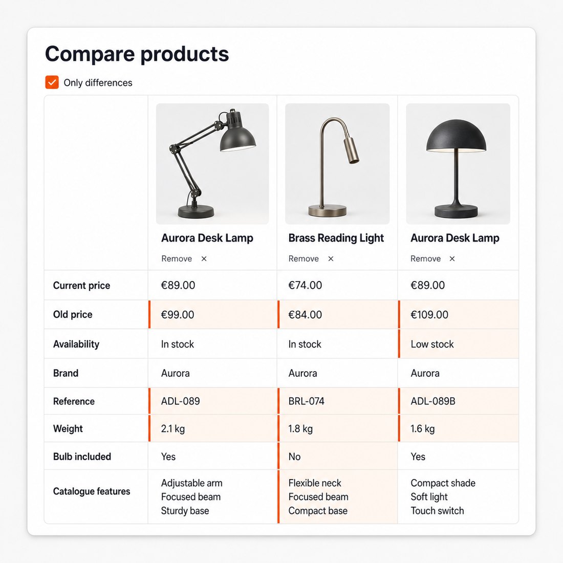
Substance, not just a price row. Each product column carries the current price and the original one when there is a discount, availability, brand, reference, weight, barcode, the short description, and every catalogue feature you maintain, in each store language. You decide which of those rows appear and in what order, so a fashion store compares different facts than a tool store.
The table does the reading for the shopper: differences and similarities are highlighted, and one control hides everything the products have in common, leaving only the rows that decide. When the winner is clear, the cart button sits in the same column, with the product's variants and stock respected, so the decision and the purchase are one motion, not two journeys.
What does the merchant control?
The frame of the whole experience. You set the maximum number of compared products, and the limit is enforced twice, in the browser for immediate feedback and on the server so a modified request cannot exceed it. You place the compare buttons where they serve your theme, switch the floating tray on or off, and shape buttons, tray and table with your own colours and text so the feature looks native, not bolted on.
Scope stays in your hands too: comparison runs storewide or only in the categories where it makes sense, and the empty-comparison page greets shoppers with your own words and a route back to the catalogue rather than a dead end.

What about guests, privacy and speed?
Comparison is for the undecided, and the undecided are usually not logged in. The shortlist lives in the visitor's own browser: no account, no registration wall, no server session to expire. It survives navigation and comes back when the visitor does.
The storefront pays almost nothing for the feature. The module loads only its own files, no outside scripts and no trackers, images in the tray and the table load only when they come into view, and every change to the shortlist happens locally and instantly. The comparison page itself is a dedicated, responsive page with room for the table on a phone as well as a desktop.

How much work are setup and upkeep?
Setup is installing and enabling. The buttons, the tray, the counter and the comparison page place themselves through the store's standard extension points, with no template editing and no developer. The three everyday decisions, limit, tray, placement, sit on one settings screen.
Upkeep is nothing: the table reads live catalogue data, so prices, availability and features are always current, and new products carry compare buttons the moment they are published. The module also watches itself, with a built-in integrity check after installation and a diagnostics screen that gathers the context support needs, so if anything ever looks off, the answer is one screen away rather than a support thread away.

-
Referencemprcompare
-
PrestaShop CompatibilityPS 1.7 – 9.x
-
Pricing ModelOne-time Purchase
-
Module TypeFront-office
-
GDPR RelevantNo
-
Business GoalBoost Conversions
-
External Account NeededNo
-
Module ComplexityLightweight Widget
-
Customer Journey StageEngage Shoppers
-
Works With PlatformNo External Platform
What customers say about us
Company reviews
5.0
★
★
★
★
★
(4 reviews)
Loading customer reviews...
No product reviews yet
Be the first to share your experience with this module.
Write a Review
MPR Compare lets shoppers shortlist products and compare them side by side before buying. It is useful for stores where customers choose between similar products by price, stock, brand, reference, weight, EAN-13, product features, or short descriptions.
Have a question about this product?
Our experts are here to help. Ask anything about installation, compatibility, or specifications.
1315
questions
9
categories
v1.0.162026-05-27
- Addedcomplete FR/DE/ES/IT/PL translations
- FixedReplace Tools::displayPrice with PriceFormatter compat wrapper
Loading full changelog...
Works Well With Product Compare
Modules our team genuinely pairs with this one, and exactly why each belongs in the same setup.
Complement
Product Compare helps shoppers choose between similar products with compare buttons, a saved shortlist and a side-by-side view of up to four items by default. A comparison is only as good as the information in it, and rich per-product detail makes the head-to-head far more meaningful.
Product Extra Info Tabs covers that detail as a separate tool, adding scannable product-page sections for specifications, care guides, documentation, files and related content so each product is fully described.
Used alongside each other, the tabs give each product page the depth shoppers need while compare lets them line several products up against each other. They are independent tools; together they support both close study of one product and structured comparison across many, so a shopper can dig into the specifics and then decide between options without leaving your store.

Workflow
Product Compare helps shoppers decide between similar products with a saved shortlist and a side-by-side view, but they first have to find those similar products among a large catalogue. Without a way to narrow down, assembling a meaningful comparison set is slow.
Filter Revolution covers that narrowing as a separate tool, with faceted filters, checkbox, radio, dropdown, slider and colour controls, clean filter URLs and SEO landing pages for selected combinations.
Used alongside each other, Filter Revolution narrows a big catalogue to a relevant set while Product Compare lets shoppers weigh the finalists from that set side by side. One does the finding and the other the deciding, a smooth path from a broad listing down to a confident choice, all without the shopper leaving your store to compare options elsewhere.

Complement
Product Compare lets shoppers line similar products up side by side, comparing specifications and attributes to choose between near-identical options. A spec comparison shows what each product is, but it does not show how reviewers rated each one.
Reviews & Ratings covers that as a separate native tool, adding moderated ratings, written feedback, optional photo reviews and review criteria for products, kept inside PrestaShop.
Used alongside each other, compare provides the factual head-to-head while reviews provide the moderated customer verdict on each option. They are independent tools; together they let a shopper weigh both the specifications and the customer feedback when deciding between products, a fuller basis for the choice than either the spec sheet or the reviews alone would give.

Workflow
Product Compare helps shoppers decide between similar products with a saved shortlist and a side-by-side comparison view, four products by default. Sometimes, though, a shopper narrows the field but is still not ready to commit, and they need a way to hold onto the candidates rather than lose them.
Smart Wishlist covers that as a separate tool, with heart buttons on lists and product pages, guest saves before sign-in and saved items kept on logged-in customers' accounts so interest survives the session.
Used alongside each other, compare supports the active decision while the wishlist preserves the contenders for later. One helps a shopper weigh options now and the other keeps those options reachable across visits, so even when a comparison does not end in an immediate purchase, the products considered are saved rather than forgotten.
 30 days return right
Easy return - no questions asked
 Plug & Play Modules
Install, set up and take profit
 Dedicated Support First
Priority Help & Satisfaction Over Sales
You might also like


